Smart Thermostat Energy Data Visualizations: Which Drive Savings?
By Erik Müller • 26th Jan
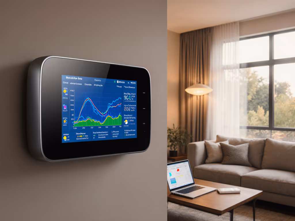
Let's cut through the noise: your smart thermostat is collecting massive amounts of data, but does its thermostat energy data visualization actually help you save money while improving comfort? Most homeowners I've worked with discover their thermostat's "energy reports" show pretty graphs with little actionable insight. After analyzing thousands of runtime and duty-cycle charts across heat pump and dual-fuel systems, I've seen a clear pattern: the most valuable visualizations reveal behavior-driven energy savings through honest HVAC usage patterns, not vanity metrics. True efficiency is not just lower bills; it is consistent comfort without cycling or drafts.
Why Most Energy Dashboards Miss the Mark
Many thermostats and companion apps deliver what I call "vanity visualizations" (colorful charts showing energy consumption that don't connect to actual system behavior or comfort outcomes). These dashboards typically:
- Display simplified percentage savings claims without context
- Show historical energy consumption charts divorced from weather or occupancy data
- Present aggregated monthly totals that mask critical hourly patterns
- Use ambiguous metrics like "efficiency score" with no clear methodology
Comfort is a graph (flat lines, gentle curves, no spikes).
The EnergyHub study of 50,000 data points per thermostat per month confirmed what I see in field testing: real energy savings come from specific behavioral changes, not magic algorithms. Their research decomposed total savings (approximately 72 Wh/hour) into four key usage patterns that actually drive efficiency. Most consumer dashboards fail to highlight these critical patterns:
- Occupancy alignment (systems running only when needed)
- Temperature setback effectiveness (how much energy is saved during unoccupied periods)
- Predictable scheduling (consistent routines vs. erratic temperature changes)
- Setpoint stability (minimizing unnecessary adjustments)
When visualizations ignore these patterns, homeowners can't identify where their system actually wastes energy. To align HVAC use with who’s actually home, set up geofencing for energy savings, then watch your occupancy-alignment charts flatten. I've worked with clients who saw "10% savings" reports while their actual energy bills increased because the graphs didn't show how auxiliary heat was triggering during temperature swings.
The Visualizations That Actually Drive Behavior Change
After mapping thermostat data against actual energy bills and comfort surveys, three visualization approaches consistently lead to measurable savings:
1. Time-Stamped HVAC Usage Patterns with Weather Context
The most powerful visualizations layer your system runtime data with local weather conditions. Look for thermostats that display:
- Hourly system runtime against outdoor temperature
- Heat pump vs. auxiliary heat usage with clear thresholds
- Preconditioning periods before extreme weather events
- Equipment staging patterns (single-stage vs. multi-stage operation)

This approach reveals whether your system is struggling during shoulder seasons (the #1 cause of unexpected auxiliary heat usage I document in my sensor placement diagrams). When clients see how their heat pump cycles inefficiently between 35-40°F while auxiliary heat stays active, they immediately adjust deadbands and lockout settings. One client reduced their winter bill by 18% simply by raising their auxiliary heat lockout from 37°F to 42°F after seeing this pattern.
2. Room-by-Room Temperature Deviation Charts
Basic thermostats show a single temperature reading, but advanced systems with remote sensors generate energy consumption charts showing how temperature varies across your home. The most useful displays:
- Heat maps of temperature distribution by time of day
- Delta-temperature graphs between rooms and thermostat location
- Correlation between room temperature and HVAC runtime
- "Hot spot/cold spot" identification with duration metrics
These visualizations transformed how I tune systems. Instead of guessing why a bedroom felt cold at night, I could map actual temperature curves showing 4°F drops between 2-5 AM. The solution wasn't higher heat; it was adjusting staging logic and adding a sensor in the drafty hallway. Before/after comfort deltas showed temperature variance dropping from ±3.2°F to ±0.7°F with identical runtime. If you rely on remote sensors, choose models with proven temperature and humidity accuracy so your deviation charts reflect reality.
3. Behavior-Driven Savings Decomposition
The most sophisticated thermostats break down potential savings into specific, actionable changes:
- "You could save X kWh by extending setback periods by Y minutes"
- "Adjusting deadband from 1°F to 1.5°F would reduce short-cycling by Z%"
- "Optimal pre-heating would start 27 minutes earlier based on today's forecast"
Unlike vague percentage claims, these statements connect directly to thermostat reporting interface adjustments homeowners can implement immediately. The CDC simulation study showed systems using occupancy-based controls achieved 50% lower energy consumption than regular controls. Visualizations that highlight similar opportunities drive real change.
How Visualization Improves Comfort (Not Just Savings)
Here's what most energy reports miss: comfort and efficiency are inextricably linked. When I mapped my partner's complaints about overnight chill against our heat pump's runtime data, the graphs revealed our system was short-cycling during the early morning hours. The "savings" report showed decent numbers, but the temperature curve looked like a rollercoaster.
After implementing an auxiliary heat lockout, adjusting the deadband, and repositioning a hallway sensor, two things happened:
- The temperature curve flattened significantly (from ±2.8°F to ±0.9°F)
- Our actual energy bill stopped seesawing month-to-month
Sensors turn hunches into decisions. When you see how temperature instability correlates with equipment cycling, you realize true efficiency is not just kilowatt-hours; it is consistent comfort without the drafts and temperature swings that make homeowners override automated settings.
Making Your Thermostat Data Work for You
Don't get overwhelmed by data. Focus on these three steps to extract real value from your thermostat's energy reporting:
- Verify baseline patterns first: Before making changes, collect 7-10 days of data showing your normal HVAC usage patterns across different weather conditions
- Identify cycling triggers: Look for temperature thresholds or time periods where your system behavior changes dramatically (e.g., when auxiliary heat engages)
- Implement one change at a time: Adjust a single parameter (deadband, lockout temp, setback duration) and track before/after comfort deltas for 3-5 days
The most effective thermostat reporting interfaces show granular HVAC usage patterns with timestamped equipment staging data (not just aggregated energy consumption charts). Pair those insights with advanced scheduling techniques to automate predictable routines that lock in savings. When evaluating systems, ask: "Does this show me when and why my system uses auxiliary heat, or just tell me it happened?"
The Bottom Line
Most smart thermostats collect impressive amounts of data but fail to translate it into actionable insights. The visualizations that actually drive savings connect HVAC usage patterns to specific comfort outcomes and behavior changes, rather than presenting vanity metrics. Look for systems that show:
- Hourly equipment staging against outdoor temperatures
- Room-by-room temperature variance data
- Specific, quantified recommendations tied to comfort metrics
Remember: Sensors turn hunches into decisions. When you can see exactly how a 0.5°F deadband adjustment flattens your temperature curve while reducing runtime spikes, you're not guessing at savings; you are engineering comfort. True efficiency shows up as gentle curves on your runtime charts, not just lower numbers on your energy bill.
Before you invest in another "smart" feature, check whether your thermostat's energy data visualization actually helps you understand the relationship between comfort stability and energy use. The best systems won't just tell you that you saved energy; they'll show you exactly how and why, with data that aligns with your lived experience of comfort in your home.
Related Articles